When you decide to open a small business, there’s a lot to consider. Do you want to be the sole owner, or do you want to split the business with someone else? What kind of storefront do you want to open, and where do you want to open it? What hours will you be open? What will your marketing budget look like?
In the midst of all that, there’s something else you don’t want to forget: The way you organize your store and lay out your merchandise also matters quite a bit. People want to buy things in an environment that feels welcoming. They want to go into a store and see that the people running the place put some thought into how things should look. They don’t want to go into a place and see a bunch of merchandise strewn around haphazardly. That shows a lack of purpose and competence. And you really want an environment that exudes both, or else you’re going to risk turning customers off as soon as they walk in the door.
Clean and simple design
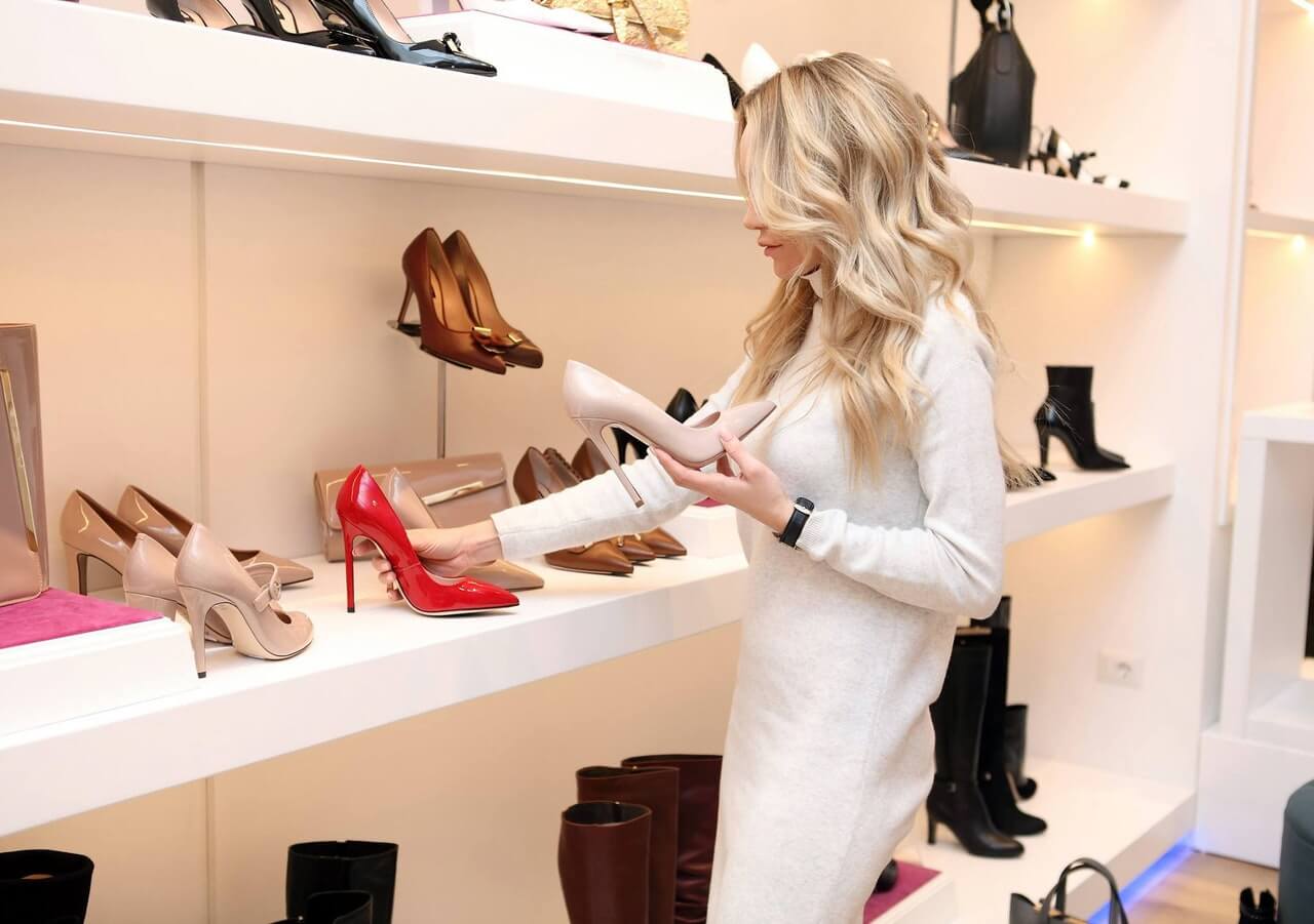
The way you display your merchandise depends in large part on what kind of merchandise you’re selling. Bookstores use shelves to display most of their products, although they also put out featured titles on tables with the covers facing up. If you walk into a hardware store, you’ll find a mix of shelves, bins, panels, and even things like steel slatwalls. In most cases, it’s best to stick to basic colors like black and white, as they’ll keep the focus on the product where it belongs. You want the display mechanism to be efficient and sturdy without drawing attention away from what you’re actually trying to sell.

The Internet gives you access to countless store designs and layouts as well. You can also think about your favorite shops. What makes them so special? What about them drives you to keep coming back and buying more of their products? Imitation is the sincerest form of flattery, and while exact duplication should be avoided, there’s nothing wrong with using another business as a rough template, then taking that template and shaping it into something of your own.
Lights, sounds, and smells
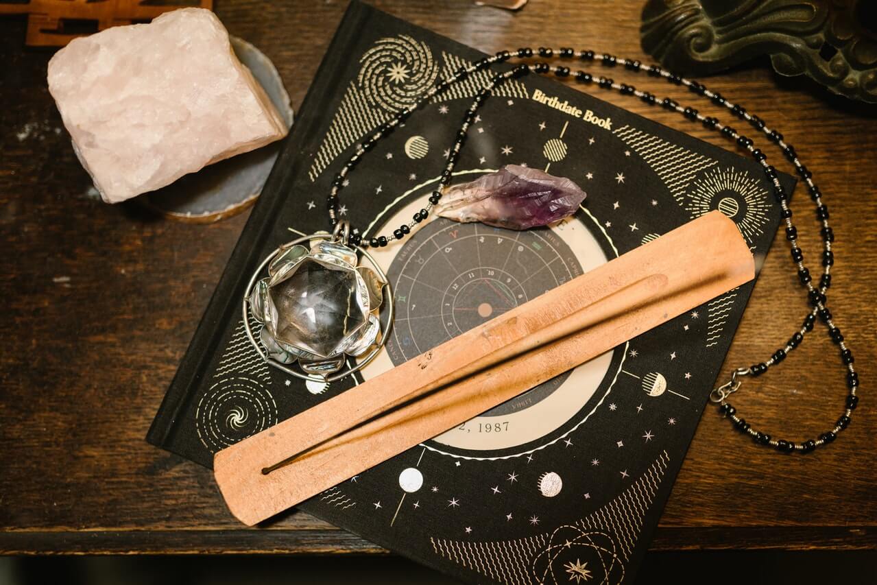
A lot of stores go with basic fluorescent lighting for their stores. They figure it’s been a retail staple for a while, so why bother changing it now? That may work fine in some cases, but if you’re selling candles and incense, it’s probably better to try out other, more subtler forms of lighting. Diffused lighting may be an option for your store’s interior or exterior as well. If you’re selling clothing, know that fluorescent lighting isn’t the most flattering option for the people who will be trying on clothes in your fitting rooms.

As far as music goes, you should try something that’s thematically appropriate for your store. Soft classical music works for a lot of stores who don’t want to risk distracting their customers with lyrics. If you go with music that has lyrics, it’s probably best to avoid death metal.
You also want your store to smell good, but you don’t want to smell like the woman on the train home who bathed in perfume. Understated is better than over-the-top. You don’t want people who are sensitive to certain smells to avoid your store, although if you’re selling fragrant soaps and candles, some of that may be unavoidable.


